A proposed re-brand of Morrisons food Range, based around everyday idioms of the English Language. Each range has a logo, a pattern and a simple colour pallet.
Recent Posts
Monday, 13 September 2010
H.Samuel re-brand
Posted by
Bequa
A YCN student competition brief to 'get more people into H.Samuels shops'. I worked collaborative to re-brand the jewellery shop into something more contemporary and fresher. The new logo and new colour pallet give a much higher quality feel to the brand.
Labels:
gift bag,
h.samuel,
jewellery,
logo,
packaging,
print,
purple,
re brand,
typography
·
0
comments

The designers storage boxes
Posted by
Bequa
A set of 5 boxes designed to fit in the plan chests in the Leeds College studios, made for designers by designers. Containg the basic equipment for a designer in a recycled cardboard box and lino print to finish.
Best of British photography
Posted by
Bequa
Based around a competition for the best British photograph I have picked a few of my best photographs from around the country.
Sovio Wine Label competition 2010
Posted by
Bequa
A Wine label competition for Sovio and their new lighter style range. They wanted something more contemporary and appealing to a younger more sophisticated audience.
Sunday, 12 September 2010
Cards
Posted by
Bequa
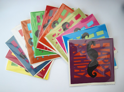
This is some work that i have put together for a Handmade fair in Leeds. Very simple style typographic cards focusing on colour and that all important moustache that seems to be a big trend at the moment.
Christmas Cards.


.JPG)


.jpg)


